
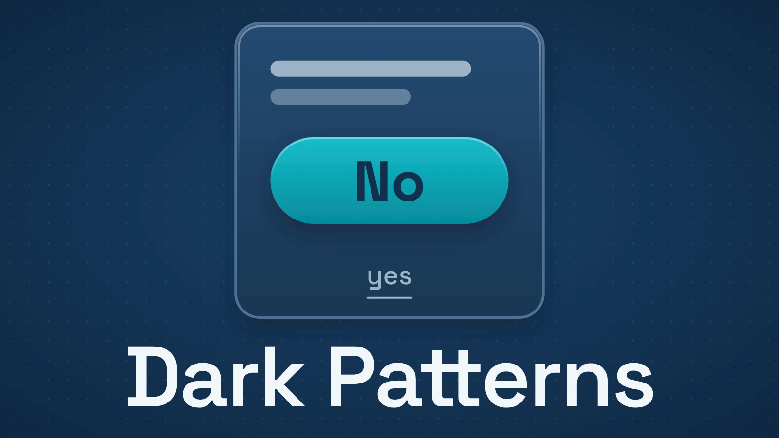
A dark pattern — increasingly called a deceptive pattern — is interface design that steers, obstructs or confuses people in ways that undermine a free and informed choice. The useful question is not whether a button looks annoying. It is what the design changes about the decision you are trying to make.
Quick answer
Look for asymmetry. If accepting is immediate but refusing requires several screens; if a price appears low until late fees arrive; if a neutral choice is visually buried; or if wording makes the unwanted option hard to understand, the interface may be doing more than presenting a choice. It may be shaping the choice itself.
Contents
- What makes a pattern deceptive?
- The most useful way to classify dark patterns is by what they do
- Hard to cancel: friction can be the product
- Hidden costs and sneaking exploit commitment
- Visual interference changes which option feels normal
- Preselection makes the default do the work
- Trick wording makes the user decode the interface
- A fast way to inspect a suspicious interface
- Dark patterns are not just "annoying design"
What makes a pattern deceptive?
Bad UX and deceptive UX overlap, but they are not identical.
A confusing checkout can be the result of poor design. A checkout that systematically hides mandatory charges until the user has invested time in the purchase creates a more specific problem: information has been delayed in a way that changes the user’s decision environment.
The U.S. Federal Trade Commission’s report Bringing Dark Patterns to Light describes designs that can trick or manipulate consumers into buying products or giving up privacy. The European Data Protection Board uses the term deceptive design patterns in its guidelines for social media interfaces.
The EU’s Digital Services Act focuses on the effect of the interface. Article 25 says covered online platforms must not design or operate interfaces in ways that deceive or manipulate users or otherwise materially impair their ability to make free and informed decisions.
That effect-based framing is useful even outside legal analysis. You do not need to know a designer’s private intention to notice that one choice has been made much harder than another.
The most useful way to classify dark patterns is by what they do
There are many taxonomies. The current Deceptive Patterns taxonomy includes categories such as sneaking, forced action, hard to cancel, preselection, obstruction, hidden costs, trick wording and visual interference.
For a reader, the names matter less than the mechanism.
| Mechanism | What the interface does | Decision it can alter | Typical signal |
|---|---|---|---|
| Hides or delays information | Keeps price, renewal or other material detail out of view until late | Whether to buy or subscribe | Fee appears only after several steps |
| Makes one path harder | Adds friction to refuse, cancel or leave | Whether to continue a service | Signup takes one click; cancellation takes a maze |
| Preselects an option | Chooses a default before the user acts | Privacy, marketing or paid add-ons | Checkbox is already selected |
| Uses visual hierarchy to steer | Makes preferred action dominant and alternative faint or distant | Consent or purchase choice | Bright primary button versus tiny text link |
| Uses confusing wording | Frames options so the consequence is unclear | Opt-in/opt-out choice | Double negatives or emotionally loaded refusal copy |
| Forces an unrelated action | Requires another disclosure or account step to complete the desired task | Data sharing or account creation | "Continue" requires marketing consent or registration |
Hard to cancel: friction can be the product
In its September 2022 report, the FTC describes its earlier ABCMouse case. The agency alleged that cancelling required six to nine screens, with links that could send people out of the cancellation path. One screen presented an upgrade offer; the route onward was a button labelled “Continue,” even though the screen looked like a different product offer.
The documented flow shows two obstacles working together: extra work to leave, and labels that make the next step uncertain. A reader trying to cancel has to distinguish the route to cancellation from offers that change or retain the subscription.
A legitimate confirmation step is different. Asking “Are you sure?” once may prevent accidental cancellation. Making the user reconfirm the same decision five times is not serving the same protective purpose.
Hidden costs and sneaking exploit commitment
A price can look attractive because it is incomplete.
When unavoidable fees appear only after the user has entered details, selected seats or invested time in a checkout, the user has more to lose by walking away. The interface has changed the comparison from “Is this product worth the full price?” to “Do I want to abandon everything I have already done?”
The Deceptive Patterns taxonomy treats hidden costs and sneaking as distinct patterns, but both demonstrate the same editorial point: timing is part of interface design. Information disclosed eventually can still be disclosed too late to support a clean decision.
Visual interference changes which option feels normal
Interfaces have always used visual hierarchy. A primary button should often be easier to find than a secondary action.
The problem begins when hierarchy is used to hide a meaningful alternative rather than organize the page.
A cookie or privacy dialog might give “Accept all” a large, high-contrast button while placing refusal behind a low-contrast link or another layer. A purchase screen may emphasize a recurring plan while making a one-time option hard to locate. The user technically has both choices, but the interface has made them unequal in salience and effort.
The Digital Services Act explicitly lists giving more prominence to certain choices as one practice for which the European Commission may issue guidance under Article 25. That does not mean every primary button is unlawful or deceptive. It shows why visual prominence can be part of the decision architecture rather than mere decoration.
Preselection makes the default do the work
Defaults are powerful because many people leave them unchanged.
A preselected insurance add-on, newsletter box or privacy setting can therefore produce an outcome without the user actively choosing it. The Deceptive Patterns taxonomy defines preselection as presenting an option that has already been selected in order to influence the decision.
There are legitimate defaults. Software needs initial settings. The warning sign is a default that benefits the provider while carrying a meaningful cost, disclosure or privacy consequence for the user, especially when the selection is easy to miss.
Trick wording makes the user decode the interface
A choice should not require linguistic gymnastics.
Examples include double negatives, labels that change meaning between screens, or refusal text written to induce shame rather than state the consequence. “No thanks, I prefer paying more” does not communicate more information than “No”; it adds emotional pressure.
This is why deceptive design is broader than visual design. Copy, timing, defaults and interaction cost all participate in the interface.
A fast way to inspect a suspicious interface
Ask these questions:
- Are the consequences visible before I commit? Price, renewal, data use and important restrictions should not arrive as a surprise.
- Are yes and no roughly comparable in effort? They do not need to look identical, but refusal should not require an obstacle course.
- Has something been chosen for me? Check preselected boxes, add-ons and privacy settings.
- Would the wording still be clear if the colors and button sizes were removed? Confusing labels remain confusing even without visual hierarchy.
- Can I reverse the decision as reasonably as I made it? Cancellation, account deletion and permission withdrawal are revealing tests.
- Is the interface asking me again after I already answered? Repetition can turn a choice into attrition.
If you encounter these obstacles, keep your original task explicit: refuse the add-on, stop renewal or cancel the service. Check the final confirmation and any effective date; save the confirmation email or screen. Reaching a retention offer does not establish that cancellation is complete. This checklist helps inspect the flow; it is not a legal test.
Dark patterns are not just "annoying design"
Calling every persuasive design choice a dark pattern makes the term less useful. A shop can recommend a product. An app can make its main action prominent. A service can ask for confirmation before deleting data.
The stronger cases have a more concrete structure: information is hidden, choices are made asymmetric, defaults are loaded, wording is misleading, or reversal is obstructed in a way that changes the user’s ability to decide.
That is also why current regulators increasingly use language such as deceptive design patterns. The issue is not that an interface is dark in appearance. It is that the interaction makes an informed choice harder than it should be.